Tuesday, October 20, 2015

3 Color Trends and Why We Should Care

Color Trends dominate the home interior industry and can have significant input when it comes to marketing, selling or creating a space. According to the Color Marketing Group, "Up to 85% of the consumer decision is based on color". Color trend groups like Paint Quality, The Pantone Institute and The Color Marketing Group spend endless energy tapping into color trends and forecasting. 


Why does this matter? In fashion, things can be quick and inexpensive to produce. If a baby blue tone is trending, a factory can easily crank out t shirts in the same hue and ride the trend wave. For the home interior industry, our products are more costly and need to have a longer shelf life. When it comes to selecting finishes like counter tops, flooring and paint colors, we really have to understand the trends to ensure our decisions are marketable and long living.

 Here are 3 color trends we should care about right now. 


1. Gray still remains strong. We will continue to see the very popular pairing of gray and white tones. Gray has overtaken the home interior market and will continue to do so. Why the love for gray? “It’s understated and sophisticated,” according to the Paint Quality Institute in a 2015 color trends report.
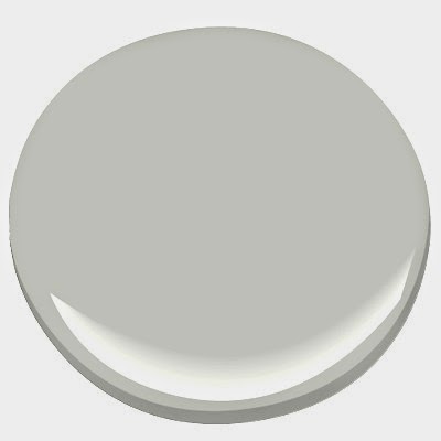
Our favorite gray this season is Revere Pewter from Benjamin Moore. 


Revere Pewter - Benjamin Moore


2. Pastels are an actual thing.  Benjamin Moore introduced 23 new colors this year, providing an array of pastel tones. Paint colors like Lavender Mist, Peach Parfait and Iced Mauve were seen through out their new collection. The Pantone Institute recommended similar pastel tones, adding a very sophisticated vibe to the colors we are seeing. 

 Another great pastel is Aqua Marine. This has been a popular color this year and has made way for various softer blues. Softer pastels indicate a desire for sophistication, which some color experts attribute to our economy. We seem to like calmer more sophisticated interior finishes when we have a sense of security. These are great ideas for secondary spaces like powder baths, laundry rooms and model homes. Primary color selection should stay neutral.

One if our favorite light blue tones is Palladium Blue - Benjamin Moore.


Another favorite is Wedgewood Gray - Benjamin Moore

3. Metallic's and anything that shines & sparkles. Shades of copper, gold, and silver is an awesome pop of sheen in the more mundane color palettes. I love the accent of gold and copper in accessories, a toss pillow or even a fun light fixture. 


Wednesday, May 27, 2015

Being Bold with Color in Model Homes

Color can be tricky. We tend to go very bold or not bold enough. When selecting color I always refer back to nature. If you want to be sure a color combination will work, look for it in nature. The number one indicator of a great model home is by far color. Color is what attracts potential renters or buyers to you. Model homes are a great way to stand out and explore with vibrant colors.
This combination of citron and gray can be an awesome pairing. The gray serves as a wonderful backdrop to the vibrant citron. This is a great color palette for multi family model interiors because it appeals to both men and women. It is playful and exciting enough to be memorable and feel new and fresh.

Benjamin Moore makes a wonderful Citron color. Yellow French is a little toned down version of the stronger Citron. Pair these with two of my favorite Benjamin Moor grays, Gray Owl and Stonington Gray. Always use flat finishes when applying a drastic color. 


The end product can offer a multi generational pleasing atmosphere. This color selection paired with stark white can really provide some awesome interior photos. As we all know, our potential renters are shopping us online first. By looking to nature for bold color pairings, you can create an online presence that sets you apart from the other properties. 


Friday, February 13, 2015

Red. the color that makes people do things.


It's Valentines Day and all, so why not explain the power of this intriguing color that we see plastered around right now. 


So what's the deal with red? It is the color of blood, fire and there has to be a reason we put it on stop signs. Red is a power color. It means courage, danger and strength all at the same time. How does red work in our world? Well, we design environments to get people want to make decisions.


Red can be a valuable tool when designing for multi-family housing. We can use the power of red to our advantage. Everything in moderation of course, so let's break down when and where we can use red and how it can help our prospective renters make decisions. 


1. Signage is a great way to add some force of color. Red makes you stop and take notice. Adding red to your exterior or marketing signage in a clean and neat fashion can really get your property noticed. 


2. Sales Areas. Red is know to elevate peoples blood pressure. It is an energy color. In a sales environment, it is important to keep peoples attention and really up the energy in a space. 


3. Offices. This is not a boring snooze color. It radiates power and determination, both traits we want our management team to be reminded of on those boring Thursday afternoons. 


4. Outside. The great thing about exterior living spaces is they get to be fun. Adding red planters or pops of red in our pool areas can really turn up volume on some tired outdoor spaces. Consider refreshing this spring with a bold red pop. 


5. Model Home. Red is definitely a memory color. Any prospective tenant that tours a model home that is laced with shades of red, will remember it. Red is an intense color and evokes emotion. Isn't that the whole reason we furnish models? We want people to get an emotional connection to a space. 

Red can be loud and obnoxious if not used in a defined and balanced way. Let us all remember the value of such a vibrant color on such an energetic day. Happy Valentines Everyone. 


Wednesday, July 16, 2014

The Greatest Store Nobody Knows About


I miss living on the east coast mostly because of the summer weather, but partly because of this store. I like to call it an experience store cause they basically took the concept of normal retail and threw it away. Terrain is an experience. It is part home decor, garden nursery, cafe and wedding venue. It is the only non-clothing store owned by the same company that brought you Urban Outfitters, Anthropolgie and Free People. Picture an outdoor nursery with small boutique shops in stand alone buildings scattered about. Then throw in a vintage green house that duals as a cafe and event space.


 They have something for everyone.
  • For the garden enthusiast: plants galore, containers and limited edition plants. 
  • For the Home Enthusiast: indoor & outdoor furniture, lighting, accessories and serving dishes.
  • For the Gift Buyer: table books, candles, photo frames, local grown food seasonings like John & Kira's Chocolate Bees, which are hand-painted in colored cocoa butter with liquid salted caramel and honey. 
  • For Anyone: Scarves, jewelry, hand bags, journals, sunglasses and hats. 


It is breath taking year round. In December they actually sale fresh cut Christmas trees and people gather around the fire pit to sip hot cocoa and shop. I could get lost there. You should get lost there. If you ever in Glen Mills,Pennsylvania or Westport,Connecticut, you must go see it. If you don't find yourself near the east coast you can always visit them online. ShopTerrain.